Tutorial
Installation
Install the plotive package from PyPI:
(.venv) $ pip install plotive
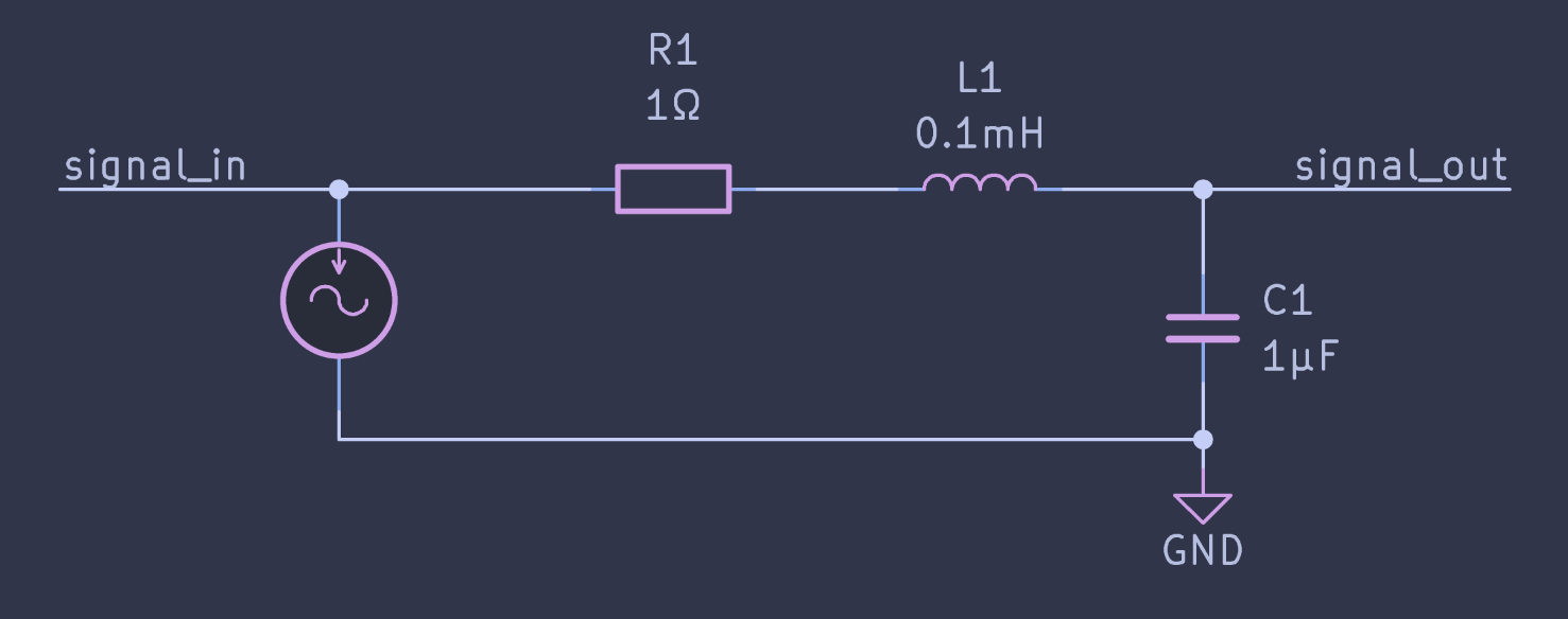
Studied case: RLC circuit
The topic of this tutorial is to create analysis plot of a RLC circuit. Here is the circuit we will study: a RLC series circuit, with output across capacitor.
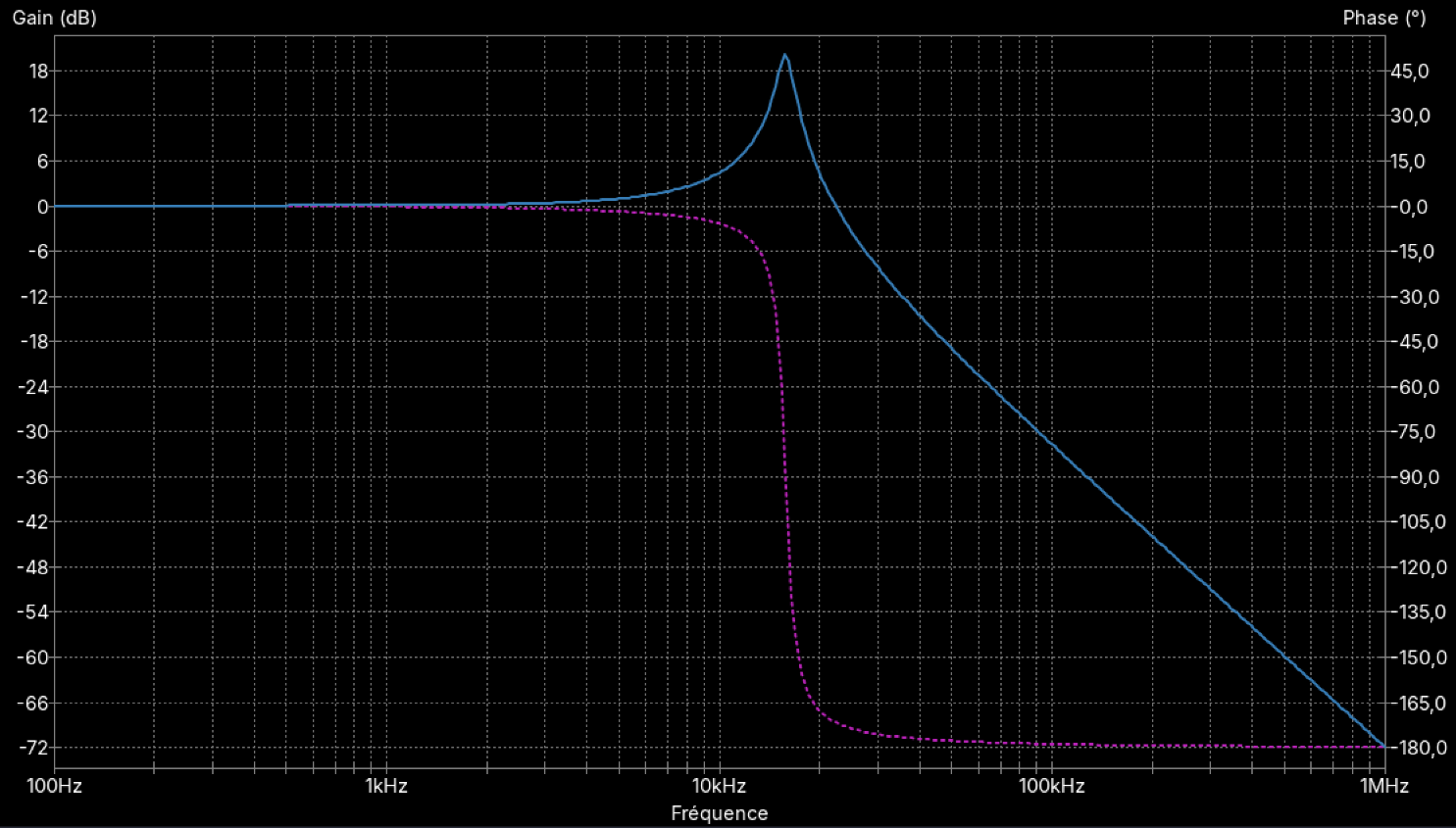
The most common plot for such circuit in signal theory is the Bode diagram of the transfer function.
Since we are in KiCad, it is easy enough to perform a simulation of frequency response with Ngspice. This will tell us what to expect. Here is the Bode plot of the Ngspice simulation between 100Hz and 1MHz:
Let’s see how to do something more styled than this with Python and plotive.
 1import plotive as pv
 2import numpy as np
 3
 4R = 1     # 1 ohm
 5L = 1e-4  # 100 µH
 6C = 1e-6  # 1 uF
 7
 8
 9# This is not an electronic class, so I won't detail too much
10# the calculation of the transfer function.
11# Just know that freq is a numpy array of frequencies in Hz, and that
12# we return a tuple of arrays (gain and phase) of the same length.
13def rlc_freq_response(freq, R, L, C):
14    """
15    Returns the transfer function of a series RLC circuit.
16    Transfer function: H(jw) = 1 / (1 - w²LC + jwRC)
17    """
18
19    pulse = 2 * np.pi * freq
20    num = 1
21    den_r = 1 - (pulse**2) * L * C
22    den_i = pulse * R * C
23
24    mag = num / np.sqrt(den_r**2 + den_i**2)
25    ph = -np.arctan2(den_i, den_r)
26
27    # convert gain to dB, phase to degrees
28    return 20 * np.log10(mag), ph * 180 / np.pi
29
30
31if __name__ == "__main__":
32    # Here is our numpy array of frequencies, from 100 Hz to 1 MHz, 200 points per decade
33    freq = np.logspace(2, 6, 801)
34    # Compute the gain and phase for our RLC circuit
35    mag, ph = rlc_freq_response(freq, R, L, C)
36
37    fig = pv.Figure(
38        title="A Bode plot",
39        plot = pv.Plot(
40            # We create two series on the same plot, one for gain and one for phase.
41            # To keep things simple, the data is inlined in the series definition, and we don't use a data source.
42            series=[
43                pv.series.Line(x=freq, y=mag, name="Magnitude"),
44                pv.series.Line(x=freq, y=ph, name="Phase"),
45            ],
46            # Customize the X-axis: logarithmic scale, automatic ticks with minor ticks, and a title.
47            x_axis=pv.Axis(
48                title="Frequency (Hz)",
49                scale="log",
50                ticks="auto",
51                minor_ticks="auto",
52            ),
53            y_axis=pv.Axis(title="Magnitude (dB) / Phase (deg)", ticks="auto", grid="auto"),
54        ),
55        # It is a good practice to include a legend when you have multiple series.
56        legend="bottom",
57    )
58
59    # Save the figure as a PNG file.
60    # You can use `fig.show()` to display it in an interactive window instead,
61    # or `fig.save_svg()` to save it as an SVG file.
62    import sys
63    filename = sys.argv[1] if len(sys.argv) > 1 else "bode.png"
64    fig.save_png(filename)
This results in the following figure.
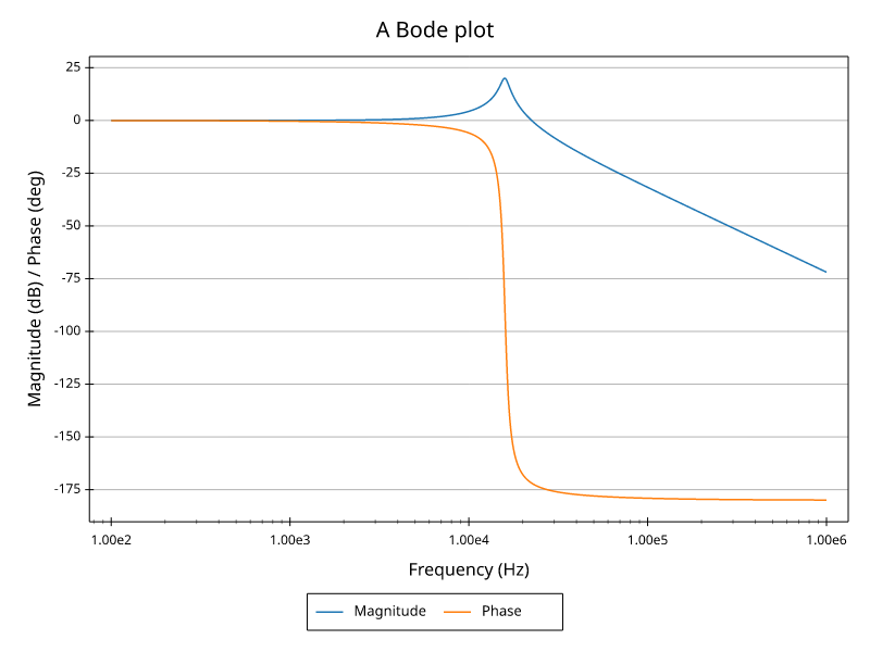
Not too bad for a first run. At least we got the physics right. Let’s continue by giving the phase a proper scale in radians as it is what physicists like to use.
 1import plotive as pv
 2import numpy as np
 3
 4R = 1     # 1 ohm
 5L = 1e-4  # 100 µH
 6C = 1e-6  # 1 uF
 7
 8
 9# This is not an electronic class, so I won't detail too much
10# the calculation of the transfer function.
11# Just know that freq is a numpy array of frequencies in hz, and that
12# we return a tuple of arrays (gain and phase) of the same length.
13def rlc_freq_response(freq, R, L, C):
14    """
15    Returns the transfer function of a series RLC circuit.
16    Transfer function: H(jw) = 1 / (1 - w²LC + jwRC)
17    """
18
19    pulse = 2 * np.pi * freq
20    num = 1
21    den_r = 1 - (pulse**2) * L * C
22    den_i = pulse * R * C
23
24    mag = num / np.sqrt(den_r**2 + den_i**2)
25    ph = -np.arctan2(den_i, den_r)
26
27    # convert gain to dB, keep phase in radians
28    return 20 * np.log10(mag), ph
29
30
31if __name__ == "__main__":
32    # Here is our numpy array of frequencies, from 100 Hz to 1 MHz, 200 points per decade
33    freq = np.logspace(2, 6, 801)
34    # Compute the gain and phase for our RLC circuit
35    mag, ph = rlc_freq_response(freq, R, L, C)
36
37    fig = pv.Figure(
38        title="A Bode plot",
39        plot = pv.Plot(
40            # We use two Y-axes, we specify that the phase series should use the axis with title "Phase (rad)".
41            # (We could also use the axis index or an arbitrary string id.)
42            series=[
43                pv.series.Line(x=freq, y=mag, name="Magnitude"),
44                pv.series.Line(x=freq, y=ph, name="Phase", y_axis="Phase (rad)"),
45            ],
46            x_axis=pv.Axis(
47                title="Frequency (Hz)",
48                scale="log",
49                ticks="auto",
50                minor_ticks="auto",
51            ),
52            # As gain and phase have different units and scales, we use two Y-axes.
53            # For clarity, we only put ticks and grid on the left Y-axis, and a title on each.
54            # The phase axis goes on the right side
55            y_axes=[ # note that we use "axEs" (plural) to specify multiple axes
56                pv.Axis(title="Magnitude (dB)", ticks="auto", grid="auto"),
57                # Radians are best scaled with ticks at multiples of pi, which we can specify with "pimultiple".
58                pv.Axis(title="Phase (rad)", ticks="pimultiple", side="right", grid="auto"),
59            ],
60        ),
61        legend="bottom",
62    )
63
64    # Save the figure as a PNG file.
65    # You can use `fig.show()` to display it in an interactive window instead,
66    # or `fig.save_svg()` to save it as an SVG file.
67    import sys
68    filename = sys.argv[1] if len(sys.argv) > 1 else "bode.png"
69    fig.save_png(filename)
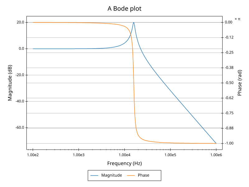
Now the phase gets its own scale in radians (note the × π annotation) and both series fit the plot. But the grid lines are not aligned and the end result doesn’t look much better.
To get a better result we are going to separate magnitude and phase on two different plots. This is how Bode plots are most often represented. As we’ll have only one series per plot, the legend is no longer needed. We will also use a proper data source dict.
 1import plotive as pv
 2import numpy as np
 3
 4R = 1     # 1 ohm
 5L = 1e-4  # 100 µH
 6C = 1e-6  # 1 uF
 7
 8
 9# This is not an electronic class, so I won't detail too much
10# the calculation of the transfer function.
11# Just know that freq is a numpy array of frequencies in hz, and that
12# we return a tuple of arrays (gain and phase) of the same length.
13def rlc_freq_response(freq, R, L, C):
14    """
15    Returns the transfer function of a series RLC circuit.
16    Transfer function: H(jw) = 1 / (1 - w²LC + jwRC)
17    """
18
19    pulse = 2 * np.pi * freq
20    num = 1
21    den_r = 1 - (pulse**2) * L * C
22    den_i = pulse * R * C
23
24    mag = num / np.sqrt(den_r**2 + den_i**2)
25    ph = -np.arctan2(den_i, den_r)
26
27    # convert gain to dB, keep phase in radians
28    return 20 * np.log10(mag), ph
29
30
31if __name__ == "__main__":
32    # Here is our numpy array of frequencies, from 100 Hz to 1 MHz, 200 points per decade
33    freq = np.logspace(2, 6, 801)
34    # Compute the gain and phase for our RLC circuit
35    mag, ph = rlc_freq_response(freq, R, L, C)
36
37    fig = pv.Figure(
38        title="A Bode plot",
39        # Multiple plots are specified with the "plots" argument, which takes a list of plot definitions.
40        plots=[
41            pv.Plot(
42                # `subplot` specifies the position of the plot in a grid layout in (row, column) tuple.
43                subplot=(1, 1),
44                series=[
45                    pv.series.Line(x="freq", y="mag"),
46                ],
47                x_axis=pv.Axis(
48                    # For the scale, we reference the scale of the phase plot.
49                    # This is how we share axes scales on multiple plots in the same figure.
50                    scale="Frequency (Hz)",
51                    ticks="auto",
52                    minor_ticks="auto",
53                ),
54                y_axis=pv.Axis(title="Magnitude (dB)", ticks="auto", grid="auto"),
55            ),
56            pv.Plot(
57                subplot=(2, 1),
58                series=[
59                    pv.series.Line(x="freq", y="ph"),
60                ],
61                x_axis=pv.Axis(
62                    title="Frequency (Hz)",
63                    scale="log",
64                    ticks="auto",
65                    minor_ticks="auto",
66                ),
67                y_axis=pv.Axis(title="Phase (rad)", ticks="pimultiple", grid="auto"),
68            )
69        ],
70    )
71
72    data_src = {
73        "freq": freq,
74        "mag": mag,
75        "ph": ph,
76    }
77
78    # Save the figure as a PNG file.
79    # You can use `fig.show()` to display it in an interactive window instead,
80    # or `fig.save_svg()` to save it as an SVG file.
81    import sys
82    filename = sys.argv[1] if len(sys.argv) > 1 else "bode.png"
83    fig.save_png(filename, data_source=data_src)
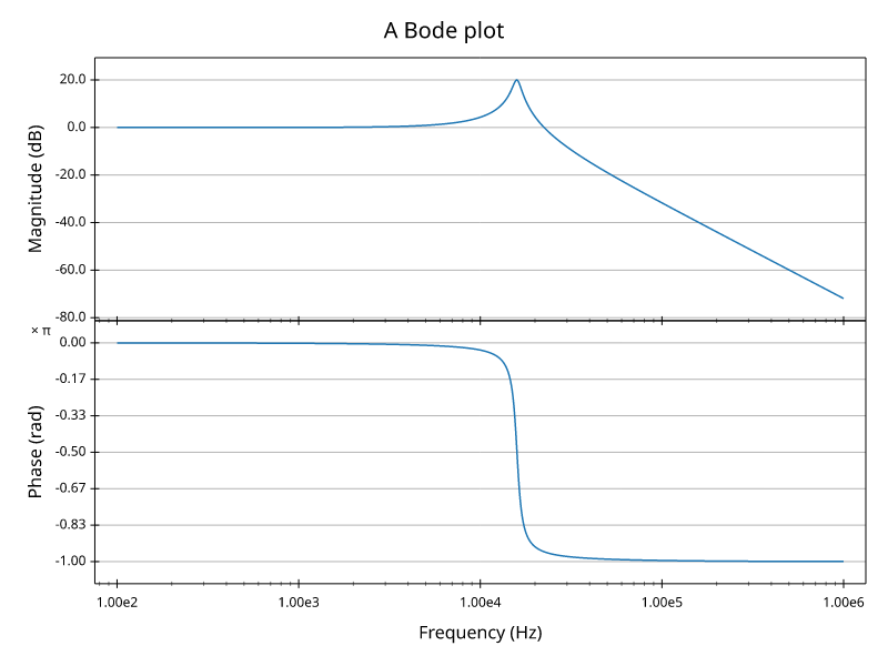
It starts to look good. Finally we use some rich text features for the title, we add some annotations and we set a modern style.
  1import plotive as pv
  2import numpy as np
  3
  4R = 1     # 1 ohm
  5L = 1e-4  # 100 µH
  6C = 1e-6  # 1 uF
  7
  8
  9# This is not an electronic class, so I won't detail too much
 10# the calculation of the transfer function.
 11# Just know that freq is a numpy array of frequencies in hz, and that
 12# we return a tuple of arrays (gain and phase) of the same length.
 13def rlc_freq_response(freq, R, L, C):
 14    """
 15    Returns the transfer function of a series RLC circuit.
 16    Transfer function: H(jw) = 1 / (1 - w²LC + jwRC)
 17    """
 18
 19    pulse = 2 * np.pi * freq
 20    num = 1
 21    den_r = 1 - (pulse**2) * L * C
 22    den_i = pulse * R * C
 23
 24    mag = num / np.sqrt(den_r**2 + den_i**2)
 25    ph = -np.arctan2(den_i, den_r)
 26
 27    # convert gain to dB, keep phase in radians
 28    return 20 * np.log10(mag), ph
 29
 30
 31if __name__ == "__main__":
 32    # Here is our numpy array of frequencies, from 100 Hz to 1 MHz, 200 points per decade
 33    freq = np.logspace(2, 6, 801)
 34    # Compute the gain and phase for our RLC circuit
 35    mag, ph = rlc_freq_response(freq, R, L, C)
 36
 37    title = "Bode diagram of a series RLC circuit\n" + \
 38            "[size=18;italic;font=serif]R = 1 Ω / L = 0.1 mH / C = 1 µF[/size;italic;font]"
 39
 40    # compute cutoff frequency of the filter
 41    cutoff_freq = 1 / (2 * np.pi * np.sqrt(L * C))
 42    # compute slope two decades after cutoff frequency for better accuracy
 43    slope = rlc_freq_response(cutoff_freq * 100, R, L, C)[0] / 2
 44
 45    fig = pv.Figure(
 46        title=title,
 47        # Multiple plots are specified with the "plots" argument, which takes a list of plot definitions.
 48        plots=[
 49            pv.Plot(
 50                # `subplot` specifies the position of the plot in a grid layout in (row, column) tuple.
 51                subplot=(1, 1),
 52                series=[
 53                    pv.series.Line(x="freq", y="mag"),
 54                ],
 55                x_axis=pv.Axis(
 56                    # For the scale, we reference the scale of the phase plot.
 57                    # This is how we share axes scales on multiple plots in the same figure.
 58                    scale="Frequency (Hz)",
 59                    ticks="auto",
 60                    minor_ticks="auto",
 61                ),
 62                y_axis=pv.Axis(title="Magnitude (dB)", ticks="auto", grid="auto"),
 63                annotations=[
 64                    pv.annot.Line(
 65                        vertical=cutoff_freq,
 66                        stroke=pv.style.Stroke(color="foreground", pattern=[5, 5]),
 67                    ),
 68                    pv.annot.Label(
 69                        xy=(cutoff_freq, -60),
 70                        text=f"{cutoff_freq/1000:.2f} kHz",
 71                        anchor="bottom-left",
 72                        angle=90,
 73                    ),
 74                    pv.annot.Line(
 75                        two_points=((cutoff_freq, 0), (cutoff_freq * 10, slope)),
 76                        stroke=pv.style.Stroke(color="foreground", pattern=[5, 5]),
 77                    ),
 78                    pv.annot.Label(
 79                        xy=(cutoff_freq * 10, slope),
 80                        text=f"{slope:.1f} dB/decade",
 81                        anchor="bottom-left",
 82                    ),
 83                ],
 84            ),
 85            pv.Plot(
 86                subplot=(2, 1),
 87                series=[
 88                    pv.series.Line(x="freq", y="ph"),
 89                ],
 90                x_axis=pv.Axis(
 91                    title="Frequency (Hz)",
 92                    scale="log",
 93                    ticks="auto",
 94                    minor_ticks="auto",
 95                ),
 96                y_axis=pv.Axis(title="Phase (rad)", ticks="pimultiple", grid="auto"),
 97            )
 98        ],
 99    )
100
101    data_src = {
102        "freq": freq,
103        "mag": mag,
104        "ph": ph,
105    }
106
107    # Save the figure as a PNG file.
108    # You can use `fig.show()` to display it in an interactive window instead,
109    # or `fig.save_svg()` to save it as an SVG file.
110    import sys
111    filename = sys.argv[1] if len(sys.argv) > 1 else "bode.png"
112    fig.save_png(filename, data_source=data_src, style="catppuccin-macchiato")
Here is the final result:
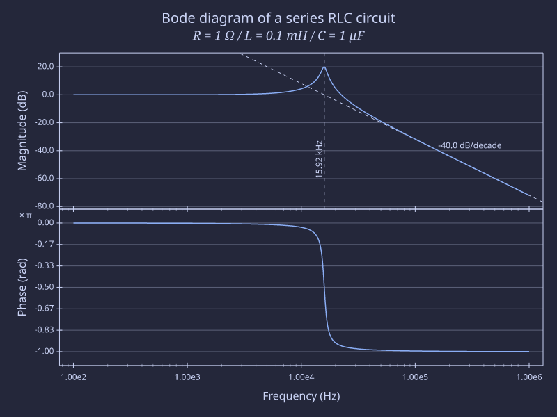
In the Gallery, there is a similar example with comparison of 3 resistor values. The code is in the project examples: https://github.com/rtbo/plotive-py/blob/main/examples/bode_rlc.py